
Creating Visuals that Speak
Creating Diagrams and Graphics in Technical Documentation that speaks.

Introduction
In technical writing, visuals play a crucial role in enhancing the documentation or any article. Well-designed visuals can enhance understanding, convey complex concepts, and make information more accessible. You can summarize a lot of words into just one visual. By adding visuals, we also increase the scrollable area of the article.
So, today we are going to look into some tips to create visuals that speak in technical documentation.
Flowcharts and Diagrams
This can be very useful when you are writing a tutorial on building an application. It can be used to illustrate processes, workflows, or system architecture. This will help the viewer to understand the workings of the application with ease.
Tools to Use:
draw.io is a free online diagramming tool that offers a wide range of shapes and connectors. This makes it easy to crease professional-looking flowcharts with ease.
Technical Drawings and Illustrations
For any kind of illustration such as showing the working of an algorithm. You can create an illustration to show how data flows in the algorithm. You can also create other illustrations to enhance the look and feel of the article.
Tool to Use:
If you know Adobe Illustrator then it is best. Otherwise, Canva is a free tool that provides lots of pre-loaded templates and shapes that you can use to create visuals.
Graphs and Charts
Graphs and charts can be useful to show any analytical data. It can be your researched data or data from any other sources. Adding graphs will make the article stand out and will be visually more appealing.
Tool to Use:
Use Excel to create graphs and charts for presenting numerical data. Excel offers a variety of chart types, and you can easily update charts as data changes. Export these charts to your documentation for clear data visualization.
Also, you can use Canva they do have some charts and there is a lot of customization you can do.
Coding Visuals
I am not a fan of adding code to an image. I prefer giving code as text so that the reader can copy it and experiment with that easily. But sometimes you might need to add that. Most of the time for me is outside the article when sharing content on Twitter or LinkedIn. You can use visuals that have code formatting for a better understanding of the code.
Tool to Use:
There are a lot of tools but the tool that I personally use is carbon. It has a lot of customization such as the programming language, theme, and export quality.
Conclusion
Remember that the choice of tools may also depend on your specific needs, preferences, and the preferences of your team or organization. These tools are examples, and there are many others available that may suit your requirements better.
I hope this issue was able to provide value to you. Thanks for reading this issue of the newsletter.
Tool of the Week
I am adding a new section to the newsletter. As the name suggests, I am going to discuss a tool. So, for the first week, Our tool of the week is AdonisJS.
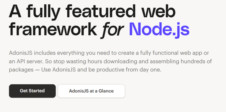
AdonisJS is a full-featured, open-source web framework for Node.js, written in JavaScript and designed to make it easier for developers to build scalable and maintainable web applications.
I have been using the framework recently for my project. The features that I like are:
how you can organize everything in a nice project structure.
Error handling.
Migration of DB is done seamlessly.
My Last Article
How To Create And Sell Notion Templates as a Developer
A guide on creating and selling notion templates online. Apart from the general guide to the notion template, it is written with developers in mind.
Transitioning to a Microservices Architecture: Overcoming Obstacles
Along with the obstacles, I will also guide you on solutions that you can use to overcome those obstacles.
Data Privacy Laws: Navigating Compliance in the Age of Big Data
We are going to look into the laws that deal with the data. In this way, you can make sure that your product is not violating any law.